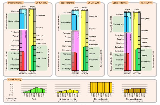

Charts showing the group's consolidated financial position as assets against liabilities and capital. Left, mid, right charts show details for consecutive results (normally every 6 months) with the latest results on the right. All three charts are to same scale so you can easily see which components have increased or decreased.
Typical components which may be of concern are large Borrowings or Pension liabilities, which could indicate the group may be vulnerable to adverse economic conditions such as increasing bank interest rates.

Bottom charts show history for several key measures of financial position, presented as UK pence per share for convenience. Pence per share is calculated as value divided by the number of ordinary shares in issue, without any consideration of minority interest. Foreign currency is converted to equivalent UK pence
History charts normally show bars every 6 months, giving a visual impression of how the company structure has developed over recent years. Generally want all history charts to be rising.