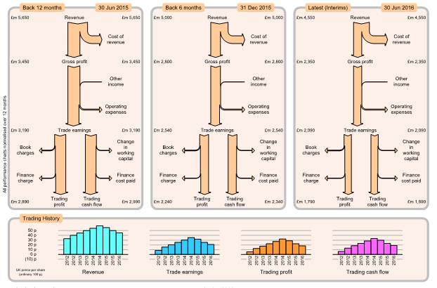

Charts showing the group's consolidated trading performance as profit flow and cash flow. Left, mid, right charts show details for consecutive results (normally every 6 months) with the latest results on the right. All three charts are to same scale so you can easily see which components have increased or decreased.
All charts are presented over the same period (normally 12 months), both for half-year and full-year results so that the charts can be compared directly and avoiding cyclic variations over the year. For Interim results, 12-month period values are calculated by adding Interim values to estimated previous second-half year values.
Book charges include non-cash costs such as depreciation and amortisation, where a cost is incurred (which affects profit) but there is no payment. Change in working capital includes goods bought or sold but where the cash has not yet been paid or received: essentially an accounting adjustment for calculating actual cash flow.

Bottom charts show history for several key measures of trading performance, presented as UK pence per share for convenience. Pence per share is calculated as value divided by the weighted average number of ordinary shares, without any consideration of minority interest. Foreign currency is converted to equivalent UK pence
History charts normally show bars every 6 months, giving a visual impression of how trading performance is progressing. Generally want all history charts to be rising.