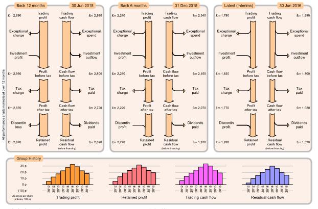

Charts showing the group's consolidated non-trading performance as profit flow and cash flow. Left, mid, right charts show details for consecutive results (normally every 6 months) with the latest results on the right. All three charts are to same scale so you can easily see which components have increased or decreased.
All charts are presented over the same period (normally 12 months), both for half-year and full-year results so that the charts can be compared directly and avoiding cyclic variations over the year. For Interim results, 12-month period values are calculated by adding Interim values to estimated previous second-half year values.
Exceptional charges and spend are typically unexpected or one-off costs such as restructuring or legal costs or fines. Investment profit and outflow are typically due to buying/selling financial stocks, machinery, buildings or even whole companies. Dividends include payments to shareholders and any non-controlling interests.

Bottom charts show history for several key measures of group performance, presented as UK pence per share for convenience. Pence per share is calculated as value divided by the weighted average number of ordinary shares, without any consideration of minority interest. Foreign currency is converted to equivalent UK pence
History charts normally show bars every 6 months, giving a visual impression of how group performance is progressing. Generally want all history charts to be rising.