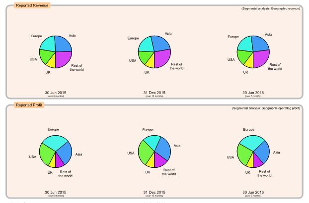

Charts showing sources of revenue and profit for the group analysed by geographical regions. Left, mid, right charts show details for consecutive results (normally every 6 months) with the latest results on the right. Any component with a negative value (such as loss instead of profit) is simply omitted from the chart.
Remember that pie charts show proportions, not absolute values: an increasing sector size may be due to an increase in that sector's value or a reduction of values in other sectors.

Charts are generated from reported values (source reference indicated in top right of each box if applicable). Unlike the Performance flow charts, there is no attempt to estimate Interim results over 12 months (which would be unreliable as the format of reported details often changes from one report to the next). A note under each chart's date indicates the period covered by that chart (normally either 6 months or 12 months).
Be aware that companies sometimes change their geographical regions or orderings so that later pie charts may show information in a different form to earlier pie charts. Always check labels on each pie chart.